Wednesday, January 18, 2017

Ashley Carlon

I believe the meter was taken on the lower legs because most of the image is black and there was a lighter glow on the bottom but by doing that the umbrella got a bit of extra exposure allowing it to glow and stand out in the image. If the lighting was anywhere else the image would be a lot brighter and we may be able to see the face of the girl. The umbrella wouldn't stand out as much.

Tuesday, November 29, 2016

Paul Schneggenburger
Eugene Kim


Comparing these images feels like a joke. The image on the top expresses much more emotion, through blurred movement during the night. Showing the distress one may experience over night. While the image on the bottom is intestine but more funny and generates a much different mood that makes you smile.

Tuesday, November 22, 2016

Abstraction- the quality of dealing with ideas rather than events. Not having a clear subject but rather just shapes, and things.

Jamey Stillings- “I explore perspectives distinct from those found on earth's surface, revealing information and insight otherwise concealed. For the past five years, the focus of my work has been documenting utility-scale renewable energy development in the”
These images have no depth of field while everything is in focus. Making everything in your face and more of a digital un realistic look.


Mary Ellen Bartley- "I’ve taken on my daily walks by the ocean. Using only the natural light that enters my house I create multiple altered versions of the same seascapes. When I photograph the prints I capture physical shapes of light, falling from skylights, squeezing." These images demonstrated more depth of field that gave the picture a more natural look. Also the imperfections of the images enhanced this.

Sunday, October 9, 2016

Oldest Family Photograph

I had my grandparents search through the oldest photos that we had in our family. They were able to send me lots of cool pictures ranging from the 30s-50s. It was cool getting to see these images of my family from so long ago. I got to see pictures of my great great grandfather charlie which was so crazy to think about. I got to see my grandpa's family picture from Athens Greece. He was the youngest(chubbiest). I saw my great grandmother taken in 1936 holding her dog. The oldest photo she sent me was from 1923. It was a picture of my great grandfather Kenny when he was 7 years old. This is my mom’s grandpa when he was really young. It was taken by his father Charlie while kenny was holding a shotgun.

Sunday, September 11, 2016

Cyanotype

"The cyanotype process, also known as the blueprint process, was first introduced by John Herschel (1792 – 1871) in 1842. Sir John was an astronomer, trying to find a way of copying his notes. Herschel managed to fix pictures using hyposulphite of soda as early as 1839. In the early days the paper was coated with iron salts and then used in contact printing. The paper was then washed in water and resulted in a white image on a deep blue background. (Apart from the cyanotype process, Herschel also gave us the words photography, negative, positive and snapshot.)"Spike MacGee


"The Phoenix artist Annie Lopez wanted to stand out among her contemporary peers. Instead of trying to invent something utterly new, she has been turning to a 174-year-old photographic printing process — cyanotypes, once used for copying architectural drawings — and giving it her own distinctive twist.

Ms. Lopez created a dress pattern cut from tamale wrapping paper and printed all over with cyanotypes, which have a distinctly cyan-blue color. She printed the cyanotypes herself, in a process that took about 25 minutes per sheet of images. No darkroom was needed." Ted Loos

She has also done her work on clothing!


Tuesday, May 5, 2015

Magazine

Front, is a picture of my friend on Darth Vadrer v6. I used a font that had a rocky feel. I thought the picture would grab your attention so I used it!
First page is an advertisement of these new climbing shoes. Next is a guide for new climbing areas. I thought the line from the climber down to the shoe was really cool and made it a little different. 
Focused on my friend Quiotee, I used him for my main focus for the article. I liked the the picture on the left was dark and almost blended in to the background.
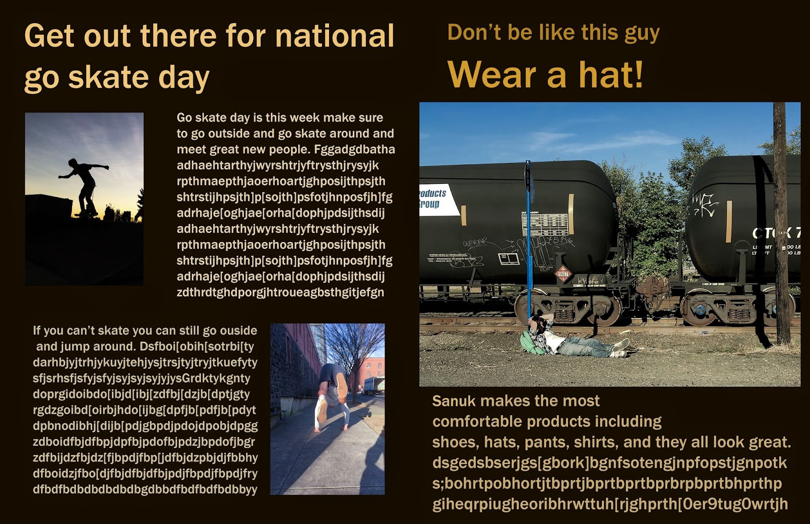
This was for national skate day, reminding people to go out and skate or just jump around. This page was made to give it a little extra life. Then a little hat add

Last page is a cool little add for milk.


Monday, April 13, 2015


I took this picture of my friend Quiotee climbing in Bishop, CA. In the picture he is wearing different types of climbing/outdoor products. The image draws your attention too look and read about the new things in the outdoor magazine. I downloaded an eroded font to help it blend into the rock. I liked the way the magazine came out and definitely think it would grab someone's attention.


This picture would have been used for a camera magazine. Advertising Nikon on the front as you can see on the strap. I edited the picture so it was really dark and the Yellow “Nikon” was really strong and popped out. I also blacked out the bottom left and right to take out extra background. The final product came out looking really mysterious and curious.

Thursday, April 9, 2015

Fine Art
I took this picture of Eli downtown. I had him looking to the right so the sun would hit his face and give him a nice golden glow. I had the contrast way up to make the image darker and a more mysterious mood. I was able to bring the saturation down and still get the glow on Elis face.Also brought the highlights up for his jacket log and zipper to pop out more. I thought the zipper looked really cool but didn't distract your eyes from the focus of the image, Eli.
Fine Art
I took this picture of jackson M. The way he looks out of the window I thought was so intense and made me curious of what he was thinking about. I made the left side of the image black so you wouldn’t know where he was. It was for you to decide and wonder. I really liked the mood and that i was able to lower the saturation and still make image look good. I also gave it a cool temperature for a better feel.

Monday, March 30, 2015

Magazine Covers


I really liked these NBA magazine covers. The first one has an older look. Its the season preview poster and the color is just right. With the NBA log being the only color other than the brown and black. It made it pop and tie the whole poster together. The italian one was a lot more fun and colorful compared to the first one. With a black and white spiral. Also the guy jumping attracted your attention more. It gave it a lot more life and energy, but I saw the unique side to both the covers and liked them both.

Thursday, March 19, 2015


Surrealism

This picture took my a very long time to get everything right. First I had to take all the images. I put Eli floating in the background upside down. I used the lighten option on him so he would blend in. I blurred the whole background for a unrealistic weird effect. Dealing with the reflection of the window was really hard. I had to paint and fix the light stand. I also added cards around Eli floating and made them white.

Monday, March 9, 2015


Surrealism is a movement in art and literature that boomed in the early twentieth century. Surrealism aimed at expressing imaginative dreams and visions free from conscious rational control. Salvador Dali was an influential surrealist painter; Jean Cocteau was a master of surrealist film.

Examples
Salvador Dali

Igor Morski 

Thursday, March 5, 2015


The image on the right is obviously the after and the one on the right is the before. I used a really cool new paintbrush I downloaded and used to give it the different boarder. I changed it to a darker bluish grey make it a cyanotype.
The image on the top is the before and the bottom is the after.I used a different brush i hadn’t used yet. I liked how it held the picture in this web like border. I changed it to a darker bluish grey make it a cyanotype.


Image on the left is the edited and the image on the right is the original. I gave this one a different tint cause I thought it would look cool as a daguerreotype. The border smooths out the corners and burns up in the bottom. It gives it an older look.


This one is my Gum Bichromate the first image is the original, the other to are the edited. This one was the hardest for me to make because the editing process was confusing and had lots of steps. I had to make all these different colors and then add a vector mask on each  of the channels. Then I painted them on and it looked okay. So I added tons of blending options till I got an image that looked really different and looked cartoon like. I flattened the image and fixed the overall brightness, exposure, gamma correction, and offset.


This one is my first Gum Bichromate. I decided to use one of my cyanotypes just to see what would happen. I had to make different color layers and then add a black vector mask on each  of the channels. Then I painted them on and it looked okay. So I added a few of blending options till I got an image that looked really different and weird.


Lastly my most complicated daguerreotype This one took lots of layers of rust and an old background of a canvas with lots of brownish tones. I took a picture of Paolo and mixed it with the rust, changed the opacity and, made it even. Then added the canvas. Flattened the image and it was done. The first time I messed up people's face and it looked really weird, after I redid it I looked better.

Thursday, February 19, 2015


In this project we learned lots of new techniques. Now I can HDR my images which gives hem a new unique look.I can also Add layers of different images which looks super cool. Lastly I can take pictures and stitch them together to make a panorama.


Multiple Exposure
This picture is of the hawthorn bridge. I made it looked older and layered a few images.
 The final product came out nicely.
Multiple Exposure
This one is also of the hawthorn bridge. I used more images and made it a little blue.
The blue gives it a cold gloomy feel. I thought it looked really unique.

HDR
Getting the lighting with all the different exposures was hard on this one.
I think it was because it was brighter and I wanted it to have the natural light. Once I got it, it
looked great.
HDR
Took this picture of my buddy charlie playing his electric fender guitar. I decided to try and HDR it.
When I did it looked really cool and the guitar had a nice glowing affect.

HDR
Took this picture in a hotel bathroom. It is a very weird picture and what better way to give it
a more weird look then HDR it. So I did and it looked great and super weird.

Panorama
This was 2 or 3 pictures I took a little while ago in Boise Idaho. At the time I didn't have panorama
so I decided to make it one. It looked awesome getting them all together.
It is a colorful unique place to take pictures.


Thursday, December 11, 2014

Kaleidoscopes

This one is of a street, and when you look at this kaleidoscopes it looks like 4 streets going off all opposite directions and you see an "X" in the middle.

This one is of a building, making it a kaleidoscopes makes it look like a futuristic space ship.
This one is the same image as above but zoomed in closer then made into another kaleidoscopes. So it looks really complex.

This one is really interesting like 2 worlds flipped. The trees in the middle don't even look real. The ground matches together and makes diamonds.