Thursday, May 21, 2015

Tuesday, May 5, 2015
Magazine
 |
| Front, is a picture of my friend on Darth Vadrer v6. I used a font that had a rocky feel. I thought the picture would grab your attention so I used it! |
 |
| First page is an advertisement of these new climbing shoes. Next is a guide for new climbing areas. I thought the line from the climber down to the shoe was really cool and made it a little different. |
 |
| Focused on my friend Quiotee, I used him for my main focus for the article. I liked the the picture on the left was dark and almost blended in to the background. |
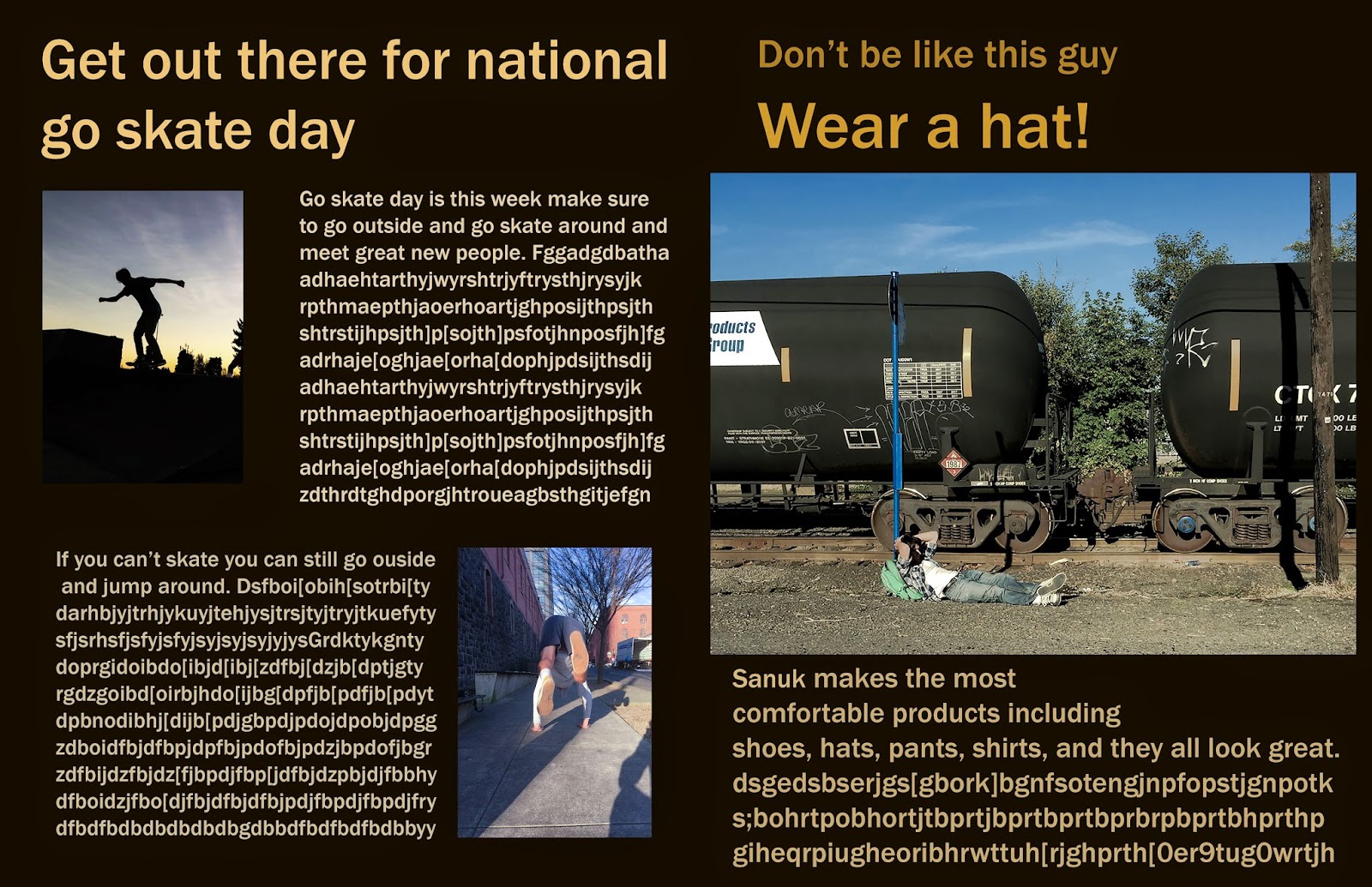 |
| This was for national skate day, reminding people to go out and skate or just jump around. This page was made to give it a little extra life. Then a little hat add |
 |
| Last page is a cool little add for milk. |
Monday, April 13, 2015
 |
I took this picture of my friend Quiotee climbing in Bishop, CA. In the picture he is wearing different types of climbing/outdoor products. The image draws your attention too look and read about the new things in the outdoor magazine. I downloaded an eroded font to help it blend into the rock. I liked the way the magazine came out and definitely think it would grab someone's attention.
|
 |
| This picture would have been used for a camera magazine. Advertising Nikon on the front as you can see on the strap. I edited the picture so it was really dark and the Yellow “Nikon” was really strong and popped out. I also blacked out the bottom left and right to take out extra background. The final product came out looking really mysterious and curious. |
Thursday, April 9, 2015
 |
| Fine Art I took this picture of Eli downtown. I had him looking to the right so the sun would hit his face and give him a nice golden glow. I had the contrast way up to make the image darker and a more mysterious mood. I was able to bring the saturation down and still get the glow on Elis face.Also brought the highlights up for his jacket log and zipper to pop out more. I thought the zipper looked really cool but didn't distract your eyes from the focus of the image, Eli. |
 |
| Fine Art I took this picture of jackson M. The way he looks out of the window I thought was so intense and made me curious of what he was thinking about. I made the left side of the image black so you wouldn’t know where he was. It was for you to decide and wonder. I really liked the mood and that i was able to lower the saturation and still make image look good. I also gave it a cool temperature for a better feel. |
Monday, March 30, 2015
Magazine Covers


I really liked these NBA magazine covers. The first one has an older look. Its the season preview poster and the color is just right. With the NBA log being the only color other than the brown and black. It made it pop and tie the whole poster together. The italian one was a lot more fun and colorful compared to the first one. With a black and white spiral. Also the guy jumping attracted your attention more. It gave it a lot more life and energy, but I saw the unique side to both the covers and liked them both.
Thursday, March 19, 2015
 |
Surrealism
This picture took my a very long time to get everything right. First I had to take all the images. I put Eli floating in the background upside down. I used the lighten option on him so he would blend in. I blurred the whole background for a unrealistic weird effect. Dealing with the reflection of the window was really hard. I had to paint and fix the light stand. I also added cards around Eli floating and made them white. |
Monday, March 9, 2015
Surrealism is a movement in art and literature that boomed in the early twentieth century. Surrealism aimed at expressing imaginative dreams and visions free from conscious rational control. Salvador Dali was an influential surrealist painter; Jean Cocteau was a master of surrealist film.
Examples
 |
| Salvador Dali |
 |
| Igor Morski |
Subscribe to:
Posts (Atom)